Popover tutorial
The popover is one of the most common interaction patterns on the web. In fact, it's such a common pattern that it's been added to the HTML specification. Since every major browser now supports HTML popovers, it's a good time to learn how they work.
This is part 1 of a two-part tutorial. In this tutorial, I will:
- explain the popover pattern;
- show you how to create a popover using markup; and
- teach you how to manage popovers with DOM scripting.
Part 2 covers how to style popovers with CSS, using a few techniques, including the ::backdrop pseudo-element, :popver-open pseudo-class and anchor positioning.
What is a popover?
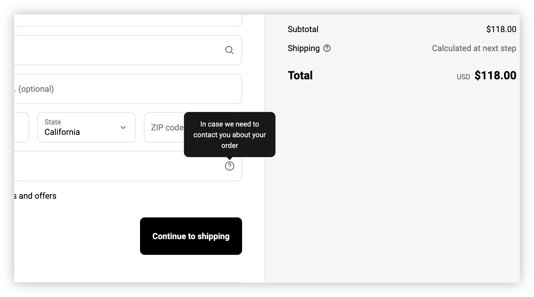
Popover interactions are common on e-commerce and banking sites.
A popover is a common interaction, in which the user hovers, taps, or clicks on a trigger to reveal (or hide) additional resources. You've probably encountered one while shopping or banking online.
Help and information panels are examples of the popover pattern. You'll also find the popover interaction used for navigation sub-menus.
Creating a popover used to require DOM scripting. Now, we can create popovers with markup alone.
Creating a popover
Each popover requires at least two parts:
- an invoking element that controls the popover; and
- a popover target.
Your invoking element must be a button. Although JavaScript can turn any element into a popover trigger, markup-only popovers require the button element.
NOTE: Save yourself some work and improve keyboard accessibility. Use a button element for your popover trigger.
On the other hand, any HTML element can be a popover target. Popover targets require a popover attribute and an id attribute.
<p id="example" popover>An example of a popover created using HTML alone.</p>
To show or hide the popover, add a popovertarget attribute value to the invoking element. Set its value to theid attribute value of its target.
<button type="button" popovertarget="example">Popover trigger</button>
You can see how this works in Figure 3.
Once a popover is visible, the default behavior is to close when the user clicks anywhere outside of the popover element, or uses the Esc key. You can choose a different popover state by changing the value of popover.
Popover states
The default value of popover is auto, but there are three possible ones: auto, manual, and hint. Each value triggers a slightly different behavior, as explained in the following table.
| Value | Behavior |
|---|---|
auto |
Closes all other popovers when opened. Clicking elsewhere on the document closes the popover. Can be closed using the Esc key, or other close request mechanism. Same as using an empty popover attribute value (i.e.: popover, popover="auto" and popover="" are equivalent). |
manual |
Showing this popover does not close other popovers. Clicking elsewhere in the document does not close the modal. Using the Esc key or other close request mechanism does not close the popover. Can only be opened or closed by its invoker. |
hint |
Closes other hint popovers when opened. Does not close auto or manual popovers. Can be closed using the Esc key, or other close request mechanism. Experimental. Partially supported.1 |
The demo below helps illustrate the differences between popover="manual" and popover="auto".
In each case, the popover trigger works as a toggle control. The same invoker both shows and hides the popover. Note that Firefox and Safari do not yet (and may never) support the hint popover value.
Using multiple invokers
If you'd rather use separate invokers to open and close a popover, change the invoker's popovertargetaction attribute value. Its default value is toggle. You can also set it to show or hide.
<button
  type="button"
  popovertarget="example"
  popovertargetaction="show"
>Popover trigger</button>
Using popovertargetaction="show", for example, means that you can't use the same popover trigger to both show and hide the popover. When the popover attribute value is manual, you'll need to use a second invoking element to hide the popover.
<button
  type="button"
  popovertarget="example"
  popovertargetaction="show"
>Popover trigger</button>
<p id="example" popover="manual">
  Popover body
<button
  type="button"
  popovertarget="example"
  popovertargetaction="hide">Close popover</button>
</p>
Here's the preceding code in action.
Remember: when the value of popover is auto or hint, clicking anywhere outside of the popover hides it. When the value is manual, that is not the case.
Manage popovers with DOM scripting
Popovers built with markup are sufficient in many cases. But for hover interactions or disappearing status message use-cases, you'll need to add some scripting.
The Popover API adds three methods to the HTMLElement interface:
showPopover(), which shows the popover;hidePopover(), which hides it; andtogglePopover(), which toggles the popover between the showing and hidden states.
Let's look at an example using the pointerenter and pointerleave events to show and hide a popover.
First the markup. We'll use standard popover markup.
<button popovertarget="showit">Hover toggle</button>
<p id="showit" popover>A popover and its contents.</p>
Using the popovertarget and popover attributes gives us some built-in features that we can build upon. The scripting portion is similarly straightforward.
const trigger = document.querySelector('[popovertarget="showit"]');

const handler = (domEvent) => {
  let {target, type} = domEvent;

  // target.popoverTargetElement refers to p#showit
  if (type === 'pointerenter') {
     target.popoverTargetElement.showPopover();
    }

  if (type === 'pointerleave') {
     target.popoverTargetElement.hidePopover();
    }
}

trigger.addEventListener('pointerenter', handler);
trigger.addEventListener('pointerleave', handler);
Hovering your pointer device over the target reveals the popover. Moving it outside of the target hides it.
I did not use togglePopover() here since I didn't disable keyboard and touch screen functionality. Site visitors can still use their keyboard or a stylus to show or hide the popover.
Next up: styling popovers
As you've probably discovered by now, default popover styles are pretty mid. (Do the kids still say "mid"?) In desktop browsers, popovers are plain boxes with black borders, positioned in the center of the viewport. In part 2: Styling popovers, we'll look at how you can make your popovers cute.
-
See What is popover=hint? by Una Kravets for a longer explanation. ↩